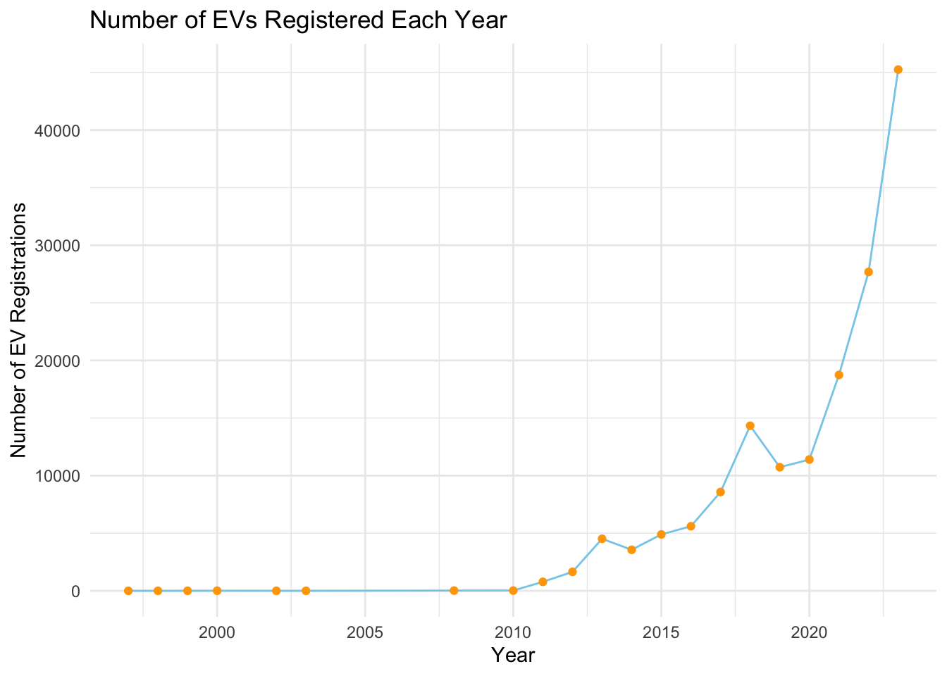
3.1 Number of EVs Registered Each Year (Up to 2023)
Code
suppressPackageStartupMessages(library(dplyr))library(ggplot2)ev_data <-read.csv('/Users/hujiasheng/Electric_Vehicle_Population_Data.csv')ev_count_by_year <- ev_data %>%group_by(Model.Year) %>%summarise(Count =n(), .groups='drop')ggplot(ev_count_by_year, aes(x = Model.Year, y = Count)) +geom_line(na.rm =TRUE, color='skyblue') +geom_point(na.rm =TRUE, color='orange') +scale_x_continuous(limits =c(NA, 2023)) +theme_minimal() +ggtitle("Number of EVs Registered Each Year") +xlab("Year") +ylab("Number of EV Registrations")
This graph illustrates the annual registration count of electric vehicles (EVs) up to 2023, showcasing a clear upward trajectory in EV adoption. The increasing trend highlights the growing consumer shift towards sustainable transportation, likely spurred by technological advancements, environmental awareness, and policy incentives. Notable surges in certain years may correspond to key market or policy developments. This visualization serves as an indicator of the EV market’s expanding footprint, reflecting the evolving landscape of automotive preferences and environmental considerations.
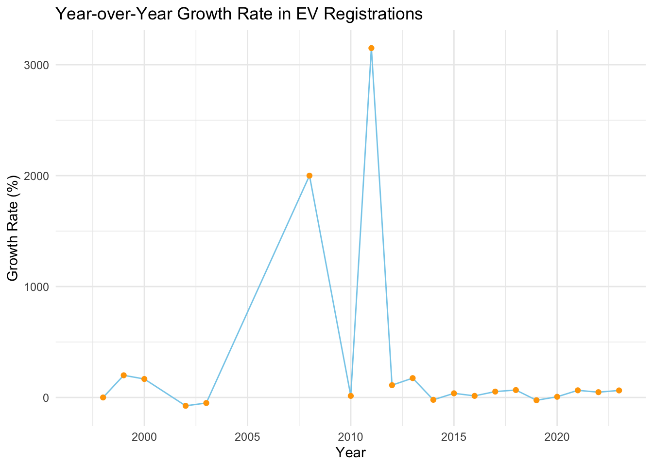
3.2 Year-over-Year Growth Rate in EV Registrations (Up to 2023)
The graph depicting the year-over-year growth rate in EV registrations presents a dynamic perspective of the market’s momentum. Fluctuations in growth rate, marked by peaks and troughs, signify periods of rapid expansion or slowdowns in EV adoption. These variations are indicative of market responses to external stimuli such as new model launches, changes in consumer preferences, or policy shifts. The graph offers insights into the market’s responsiveness and periods of heightened interest in EVs, providing a nuanced understanding of the factors driving the EV market’s evolution.
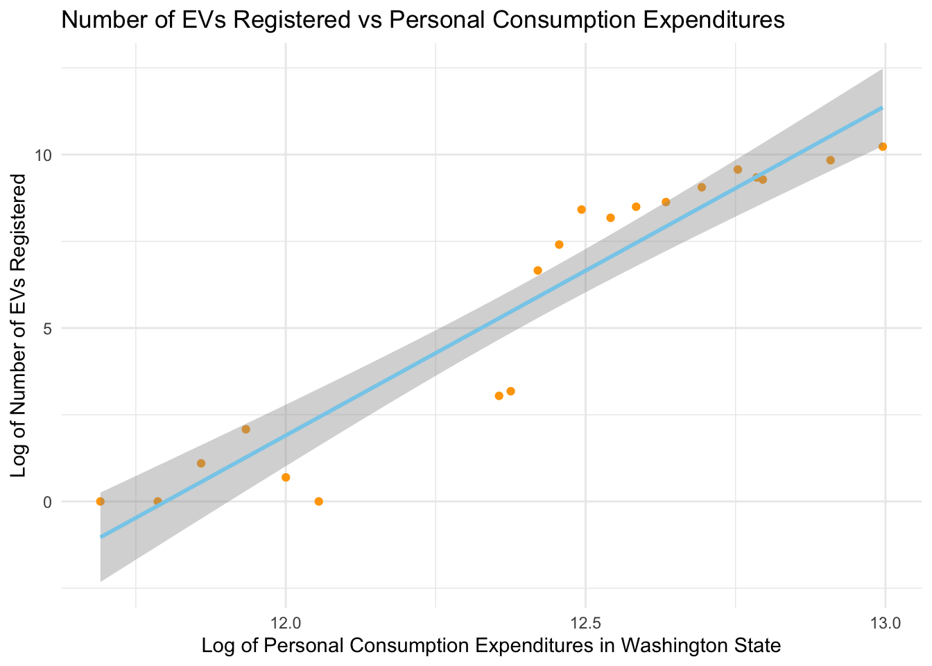
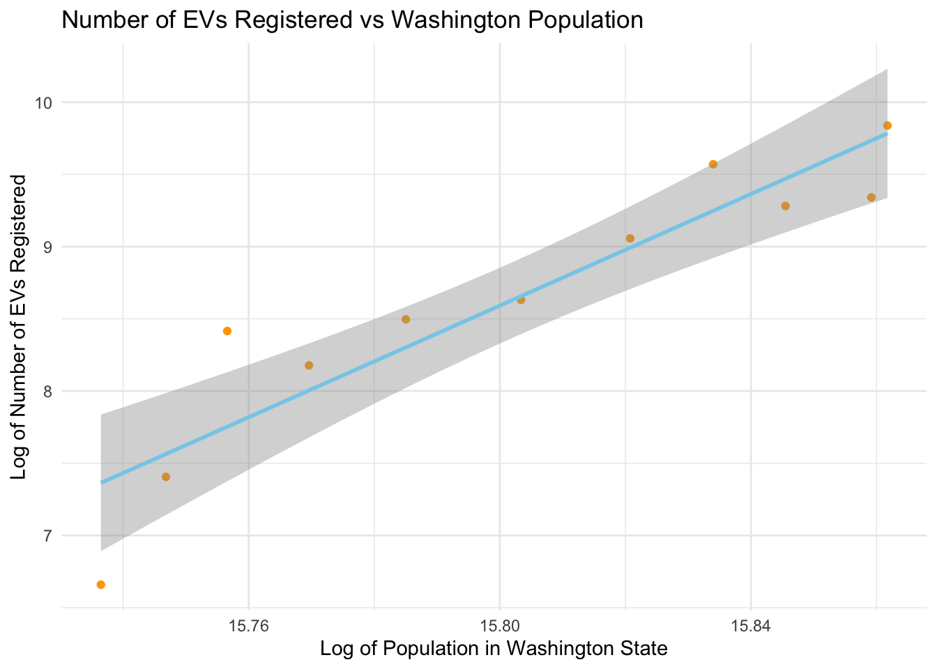
3.3 Assosication Bwteen Number of EVs Registered in WA vs Socio-economic Factors
Code
suppressPackageStartupMessages(library(tidyverse))pce_data <-read.csv('/Users/hujiasheng/SAPCE3_WA_1997_2022.csv')gdp_data <-read.csv('/Users/hujiasheng/WA_Data_GDP.csv')# Preprocessing for PCE datapce_filtered <- pce_data %>%slice(1:1) %>%select(7:ncol(pce_data)) %>%select(-2)pce_long <- pce_filtered %>%pivot_longer(cols =-Description, names_to ="Year", values_to ="PCE" ) %>%select(-1)pce_long$Year <-as.integer(sub("X", "", pce_long$Year))colnames(ev_count_by_year)[1] ="Year"merged_data_pce <-merge(ev_count_by_year, pce_long, by ="Year")# Preprocessing for GDP datacolnames(gdp_data)[1] ="Year"gdp_data$Washington.Per.Capita.GDP <-gsub("\\$", "", gdp_data$Washington.Per.Capita.GDP)gdp_data$Washington.Per.Capita.GDP <-as.integer(gsub(",", "", gdp_data$Washington.Per.Capita.GDP))gdp_data$Washington.Population <-as.integer(gsub(",", "", gdp_data$Washington.Population))merged_data_gdp <-merge(ev_count_by_year, gdp_data, by ="Year")# Plot 1: Number of EVs Registered vs Personal Consumption Expendituresggplot(merged_data_pce, aes(x =log(PCE), y =log(Count))) +geom_point(color='orange') +geom_smooth(method ='lm', formula = y ~ x, se =TRUE, color ="skyblue") +theme_minimal() +labs(title ="Number of EVs Registered vs Personal Consumption Expenditures",x ="Log of Personal Consumption Expenditures in Washington State",y ="Log of Number of EVs Registered")
Code
# Plot 2: Number of EVs Registered vs Washington Populationggplot(merged_data_gdp, aes(x =log(Washington.Population), y =log(Count))) +geom_point(color ="orange") +geom_smooth(method ='lm', formula = y ~ x, se =TRUE, color ="skyblue") +theme_minimal() +labs(title ="Number of EVs Registered vs Washington Population",x ="Log of Population in Washington State",y ="Log of Number of EVs Registered")
Code
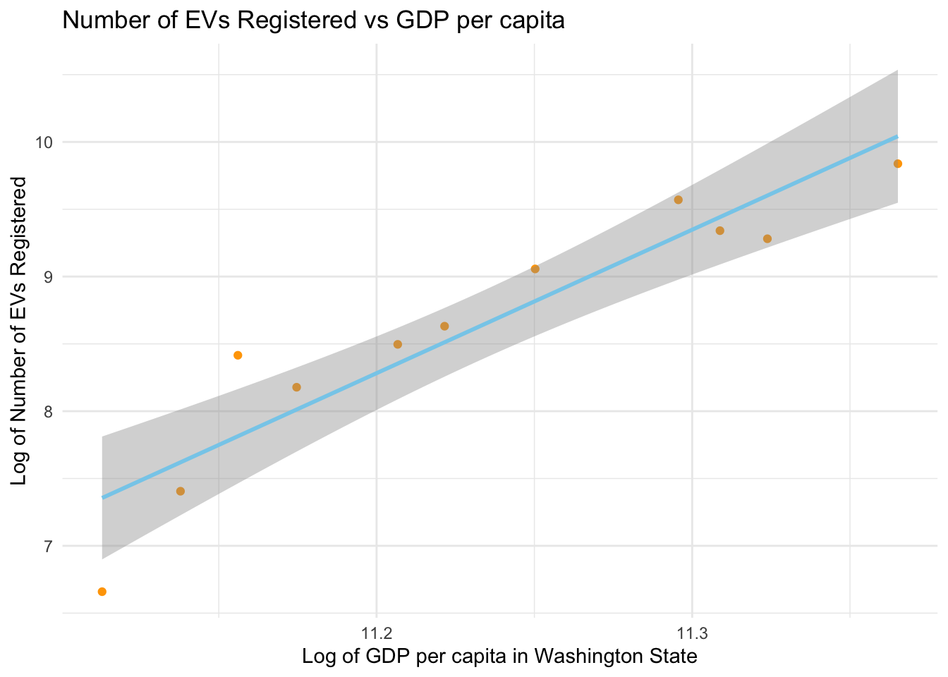
# Plot 3: Number of EVs Registered vs GDP per capitaggplot(merged_data_gdp, aes(x =log(Washington.Per.Capita.GDP), y =log(Count))) +geom_point(color ="orange") +geom_smooth(method ='lm', formula = y ~ x, se =TRUE, color ="skyblue") +theme_minimal() +labs(title ="Number of EVs Registered vs GDP per capita",x ="Log of GDP per capita in Washington State",y ="Log of Number of EVs Registered")
The three scatter plots illustrate the logarithmic relationship between the number of electric vehicles (EVs) registered in Washington State and key economic indicators. The first plot suggests a positive correlation between EV registrations and personal consumption expenditures, indicating that as consumer spending increases, so does the adoption of EVs. The second plot shows a less clear relationship with population, suggesting other factors may influence EV adoption rates. Lastly, the third plot hints at a potential positive correlation between EV registrations and GDP per capita, implying that wealthier areas may have higher EV uptake. Together, these graphs provide insights into the economic dimensions that may affect EV adoption.
3.4 Comparative Analysis of EV Adoption by Type (PHEV vs BEV)
Code
library(ggplot2)library(dplyr)filtered_ev_data <- ev_data %>%filter(Electric.Vehicle.Type %in%c("Plug-in Hybrid Electric Vehicle (PHEV)", "Battery Electric Vehicle (BEV)"))ev_type_by_year <- filtered_ev_data %>%count(Model.Year, Electric.Vehicle.Type) %>%filter(Model.Year >=2005)ggplot(ev_type_by_year, aes(x = Model.Year, y = n, fill = Electric.Vehicle.Type)) +geom_bar(stat ="identity", position ="stack") +scale_x_continuous(limits =c(2005, 2025)) +scale_fill_manual(values =c("skyblue", "orange")) +theme_minimal() +labs(title ="Comparative Analysis of EV Adoption by Type (PHEV vs BEV)",x ="Year",y ="Number of Registrations",fill ="Electric Vehicle Type")
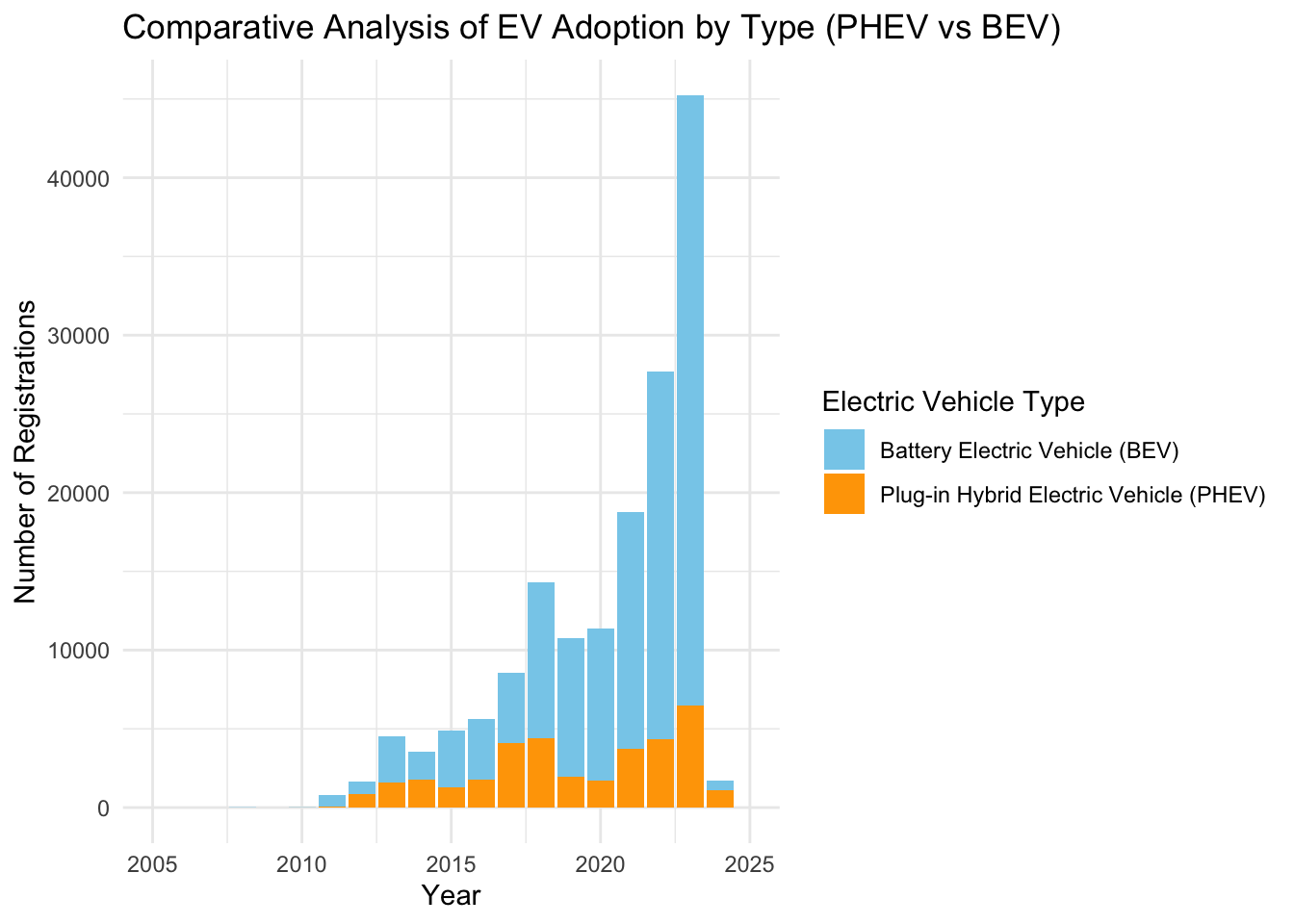
The graph provides a comparative analysis of adoption rates between Plug-in Hybrid Electric Vehicles (PHEVs) and Battery Electric Vehicles (BEVs). It reveals distinct trends in consumer preferences and technological advancements over the years. The stacked bar chart format clearly illustrates the proportionate dominance of each EV type per year, showcasing the shifting market dynamics. Key observations include the fluctuating popularity between PHEVs and BEVs, potentially influenced by evolving technology, policy changes, and market availability. This visualization serves as a valuable tool for understanding the trajectory of electric vehicle adoption, highlighting the nuanced preferences within the EV market.
3.5 Spatial Distribution of EVs in States
Code
suppressPackageStartupMessages(library(sf))suppressPackageStartupMessages(library(maps))state_map <-map_data("state")ev_data <- ev_data %>%mutate(Longitude =as.numeric(sub(".*\\(([^ ]+).*", "\\1", `Vehicle.Location`)),Latitude =as.numeric(sub(".* ([^ ]+)\\).*", "\\1", `Vehicle.Location`)) ) %>%filter(!is.na(Longitude) &!is.na(Latitude))coordinates <-st_as_sf(ev_data, coords =c("Longitude", "Latitude"), crs =4326)ggplot() +geom_polygon(data = state_map, aes(x = long, y = lat, group = group), fill ="white", color ="black") +geom_sf(data = coordinates, color ="skyblue", size =1, alpha =0.5) +theme_minimal() +labs(title ="Spatial Distribution of EVs in Washington State",x ="Longitude",y ="Latitude")
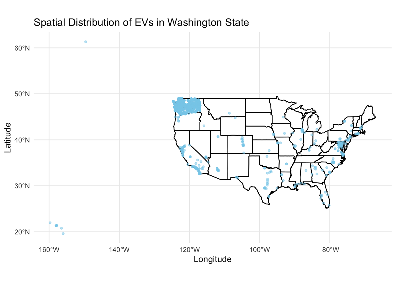
The visualization maps the current registration of Battery Electric Vehicles (BEVs) and Plug-in Hybrid Electric Vehicles (PHEVs) in Washington State as recorded by the Department of Licensing (DOL). The higher density of points in the western part of the state likely reflects the greater population and infrastructure in urban areas such as Seattle, indicating a correlation between EV adoption and urbanization. The presence of EVs across more remote regions highlights a statewide commitment to sustainable transportation, despite varying levels of charging infrastructure and urban density. This spread underscores the importance of EVs in Washington’s push for greener mobility solutions.
3.6 Spatial Distribution of EVs in Washington State
Code
washington_map <-map_data("state", region ="washington")ev_data_WA <- ev_data %>%mutate(Longitude =as.numeric(sub(".*\\(([^ ]+).*", "\\1", `Vehicle.Location`)),Latitude =as.numeric(sub(".* ([^ ]+)\\).*", "\\1", `Vehicle.Location`)) ) %>%filter(!is.na(Longitude) &!is.na(Latitude)) %>%filter(between(Longitude, -124.848974, -116.916031) &between(Latitude, 45.543541, 49.002494))coordinates <-st_as_sf(ev_data_WA, coords =c("Longitude", "Latitude"), crs =4326)ggplot() +geom_polygon(data = washington_map, aes(x = long, y = lat, group = group), fill ="white", color ="black") +geom_sf(data = coordinates, color ="skyblue", size =1, alpha =0.5) +theme_minimal() +labs(title ="Spatial Distribution of EVs in Washington State",x ="Longitude",y ="Latitude")
Code
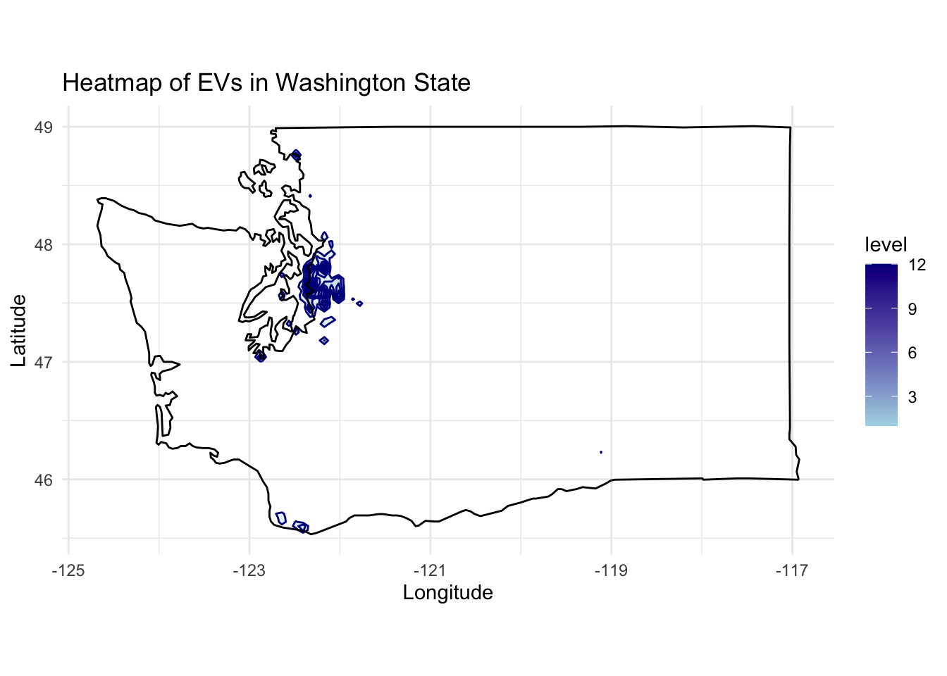
# Calculating the density of points to create a heatmapev_data_WA <- ev_data_WA %>%ggplot(aes(x = Longitude, y = Latitude)) +stat_density2d(aes(fill =after_stat(level)), geom ="polygon", color ="darkblue", alpha =0.3) +scale_fill_gradient(low ="lightblue", high ="darkblue") +geom_polygon(data = washington_map, aes(x = long, y = lat, group = group), fill =NA, color ="black") +coord_fixed(1.3) +labs(title ="Heatmap of EVs in Washington State",x ="Longitude",y ="Latitude") +theme_minimal()print(ev_data_WA)
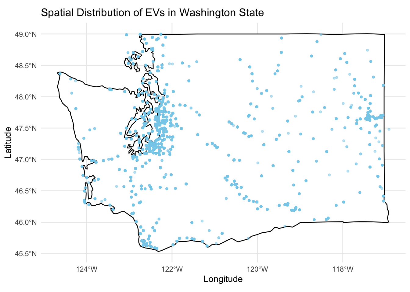
The map showcases the geographical spread of electric vehicles (EVs) across Washington State, with a notable concentration in the metropolitan area around Puget Sound, including Seattle. This distribution pattern aligns with urban population densities and the availability of EV infrastructure such as charging stations. The scatter of EVs beyond these hubs into more rural areas indicates a broader adoption, possibly encouraged by state policies and incentives. The map highlights key areas for potential infrastructure development and offers a visual representation of EV penetration, which is crucial for planning future expansions of green transportation initiatives in Washington.
3.7 Top 10 Counties by EV Distribution in Washington State
Code
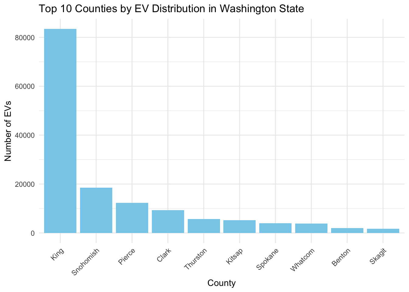
county_distribution <- ev_data %>%count(County, sort =TRUE) %>%top_n(10, n)ggplot(county_distribution, aes(x =reorder(County, -n), y = n)) +geom_bar(stat ="identity", fill ="skyblue") +labs(title ="Top 10 Counties by EV Distribution in Washington State",x ="County",y ="Number of EVs") +theme_minimal() +theme(axis.text.x =element_text(angle =45, hjust =1))
The bar chart illustrates the top 10 counties in Washington State by electric vehicle (EV) distribution. King County leads by a substantial margin, reflecting a higher rate of EV adoption, likely due to urbanization and infrastructure support. Snohomish and Pierce counties follow, indicating significant EV presence. The chart reveals a stark contrast between King County and the others, suggesting a potential focus area for expanding EV infrastructure and incentives. The distribution pattern underscores the correlation between population density, infrastructure, and EV adoption rates across different regions.
3.8 Distribution of EV Makers in Washington State
Code
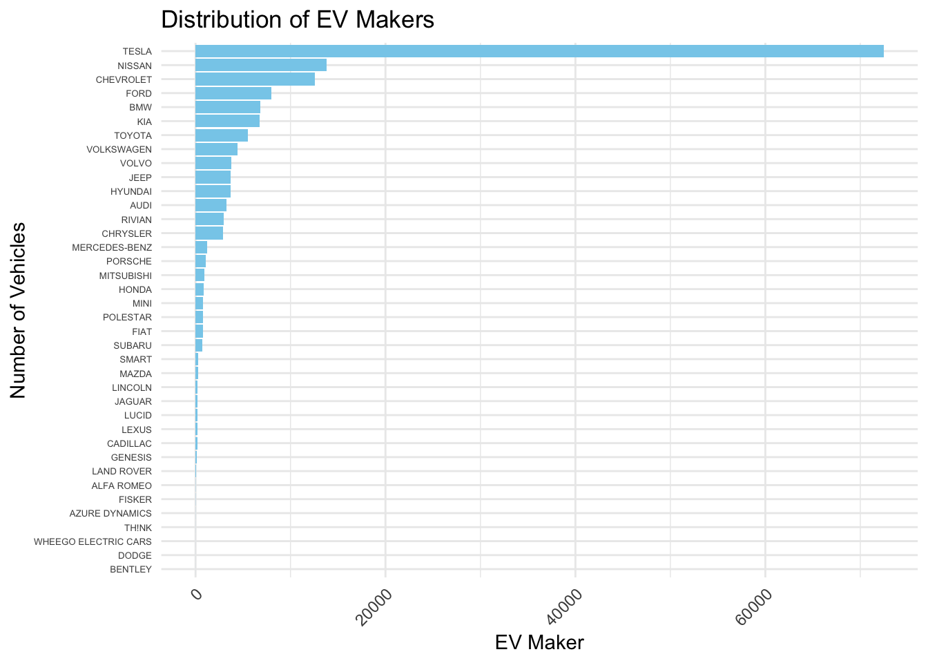
suppressPackageStartupMessages(library(dplyr))library(ggplot2)#ev_data <- read.csv('/Users/gothicowl/Desktop/Electric_Vehicle_Population_Data.csv')ev_maker_freq <- ev_data %>%count(Make) %>%arrange(desc(n)) ggplot(ev_maker_freq, aes(x =reorder(Make, n), y = n)) +geom_bar(stat ="identity", fill='skyblue') +coord_flip() +theme_minimal() +labs(title ="Distribution of EV Makers",x ="Number of Vehicles",y ="EV Maker") +theme(axis.text.y =element_text(size=5), axis.text.x =element_text(angle =45, hjust =1))
The bar chart depicts the distribution of electric vehicles (EVs) by maker, highlighting Tesla’s significant lead in the market. Other prominent manufacturers like Nissan and Chevrolet also show substantial numbers, pointing towards a competitive but unevenly distributed market landscape. The long tail of the distribution suggests a wide variety of makers with smaller presences, indicating a market that is both diverse in offerings and concentrated in top players. The chart effectively underscores the disparity in EV production among manufacturers and hints at market dominance by a few key players.
3.9 Popularity of Tesla Models in Washington State
Code
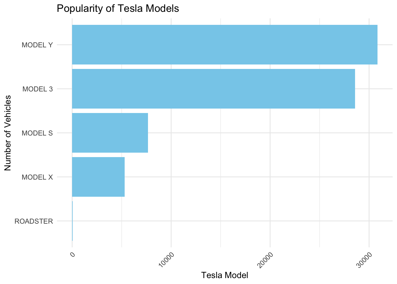
suppressPackageStartupMessages(library(tidyverse))tesla_models_freq <- ev_data %>%filter(Make =="TESLA") %>%count(Model) %>%arrange(desc(n))ggplot(tesla_models_freq, aes(x =reorder(Model, n), y = n)) +geom_bar(stat ="identity", fill ="skyblue") +coord_flip() +theme_minimal() +labs(title ="Popularity of Tesla Models",x ="Number of Vehicles",y ="Tesla Model") +theme(axis.text.x =element_text(angle =45, hjust =1)) # Rotate x labels for better readability
The bar chart reveals the relative popularity of Tesla models, with the Model Y leading, followed closely by Model 3, suggesting a strong consumer preference for these models. The substantial gap between these and the luxury Model S and X indicates market trends favoring more affordable options. The Roadster’s presence, while minimal, hints at niche appeal. The distribution reflects Tesla’s market strategy and consumer buying patterns, emphasizing the shift towards more accessible electric vehicles.
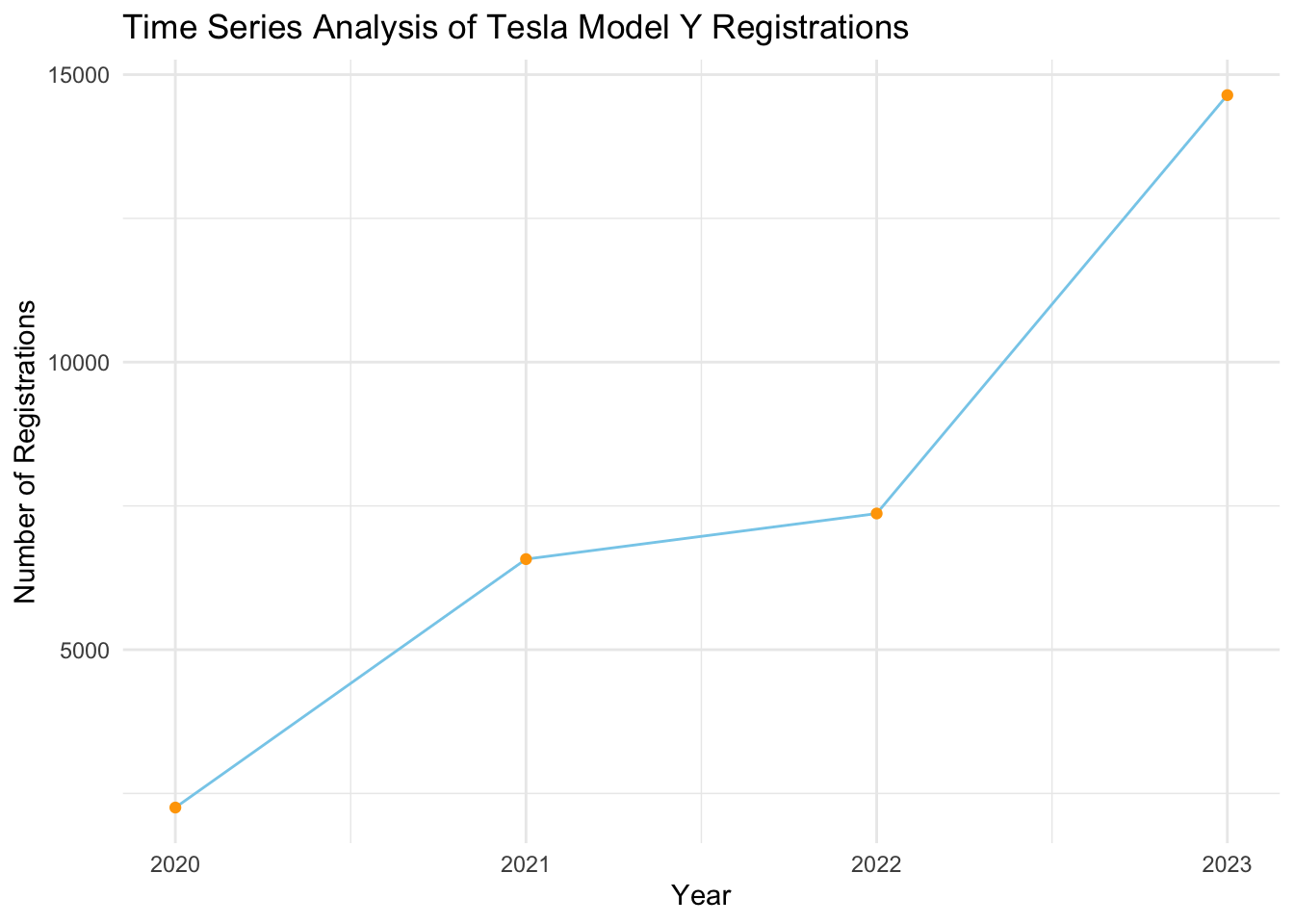
3.10 Time Series Analysis of Tesla Model Y Registrations in Washington State
Code
model_y_data <- ev_data %>%filter(Make =="TESLA", Model =="MODEL Y") %>%group_by(Model.Year) %>%summarise(Count =n())# Create a time series plotggplot(model_y_data, aes(x = Model.Year, y = Count)) +geom_line(group=1, color='skyblue') +geom_point(color='orange') +theme_minimal() +labs(title ="Time Series Analysis of Tesla Model Y Registrations",x ="Year",y ="Number of Registrations")
The time series plot illustrates a significant upward trend in Tesla Model Y registrations from 2020 to 2023. The steep incline indicates a rapid growth in popularity, reflecting strong market acceptance and possibly the impact of Tesla’s expanding production capacity and marketing efforts. The consistent year-over-year increase suggests the Model Y is becoming a dominant player in the EV market, likely due to its blend of affordability, features, and brand appeal. This growth trajectory underscores the Model Y’s significance in Tesla’s lineup and its role in the broader shift towards electric mobility.
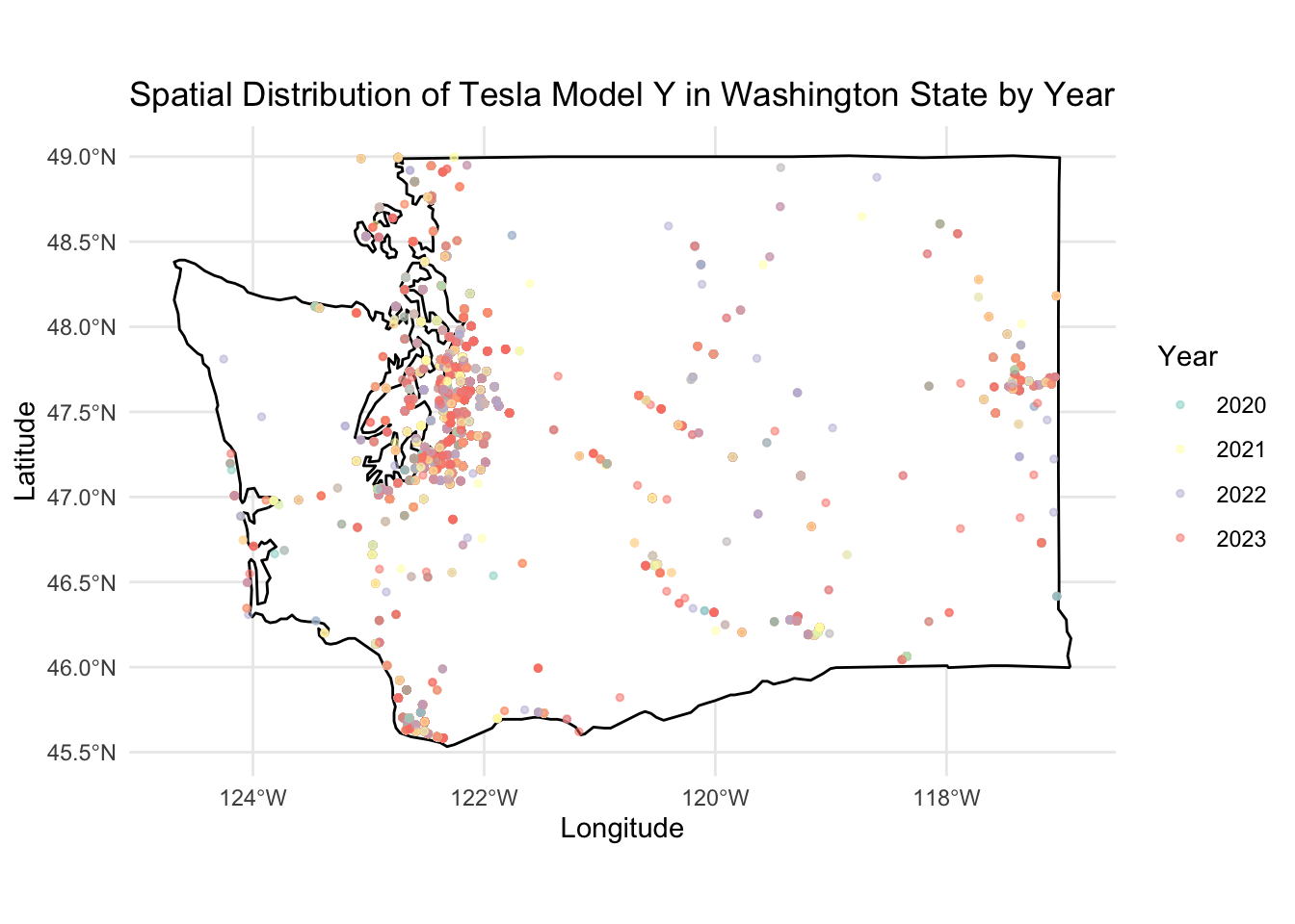
3.11 Spatial Distribution of Tesla Model Y in Washington State
Code
suppressPackageStartupMessages(library(sf))library(maps)ev_data_WA_model_y <- ev_data %>%filter(Model =="MODEL Y") %>%mutate(Longitude =as.numeric(sub(".*\\(([^ ]+).*", "\\1", `Vehicle.Location`)),Latitude =as.numeric(sub(".* ([^ ]+)\\).*", "\\1", `Vehicle.Location`)),Year =as.factor(Model.Year) ) %>%filter(!is.na(Longitude) &!is.na(Latitude)) %>%filter(between(Longitude, -124.848974, -116.916031) &between(Latitude, 45.543541, 49.002494))coordinates_model_y <-st_as_sf(ev_data_WA_model_y, coords =c("Longitude", "Latitude"), crs =4326)washington_map <-map_data("state", region ="washington")ggplot() +geom_polygon(data = washington_map, aes(x = long, y = lat, group = group), fill ="white", color ="black") +geom_sf(data = coordinates_model_y, aes(color = Year), size =1, alpha =0.5) +# Color by Yearscale_color_brewer(palette ="Set3") +theme_minimal() +labs(title ="Spatial Distribution of Tesla Model Y in Washington State by Year",x ="Longitude",y ="Latitude") +theme(legend.position ="right")
Comparing the spatial distribution of all EVs in WA, the spatial distribution of Tesla Model Y in Washington State reveals a similar geographical trend, with dense clustering around urban centers. The Model Y exhibits a focused concentration in specific areas, suggesting a strong market presence in affluent or tech-savvy communities. While both distributions are widespread, reflecting general EV adoption, the Model Y’s distribution may indicate targeted consumer demographics and the success of Tesla’s marketing strategies within those segments.